Hello! My Name is Sebastian Kayle
I’m Sebastian, a designer, lover of red wine and above all father of an amazing 6 year old boy. If you’d ask him I’d also be part time astronaut, caveman and his preferred method of transportation!
My design journey started last year in April when I decided to follow my love for drawing and sign up with the TGDS. Most of my professional life I have worked in hospitality, from a chef to a restaurant manager. The time was right to transition into an industry that not only inspired me on a daily basis but also offered me more time with my son.
It has been an amazing journey so far and I am excited about the path ahead!
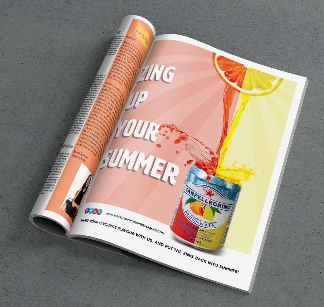
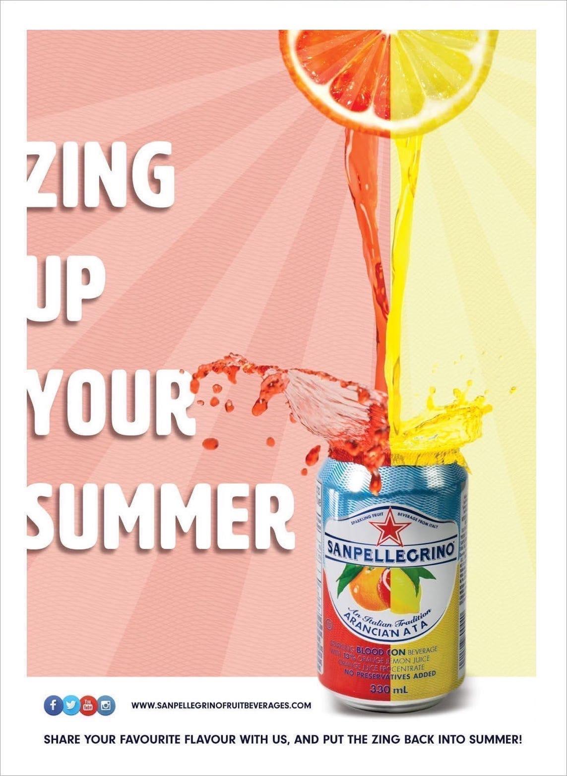
Advert Design — San Pellegrino
The concept was to create an ad that captures the freshness and vibrancy associated with the product and also highlights the variety of flavours available.
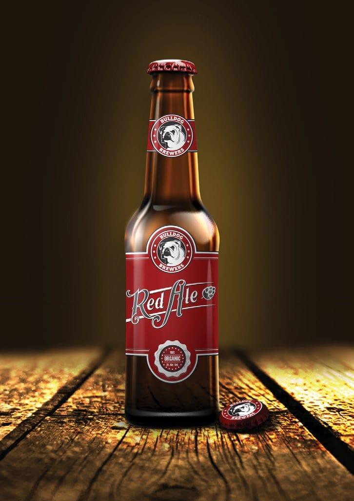
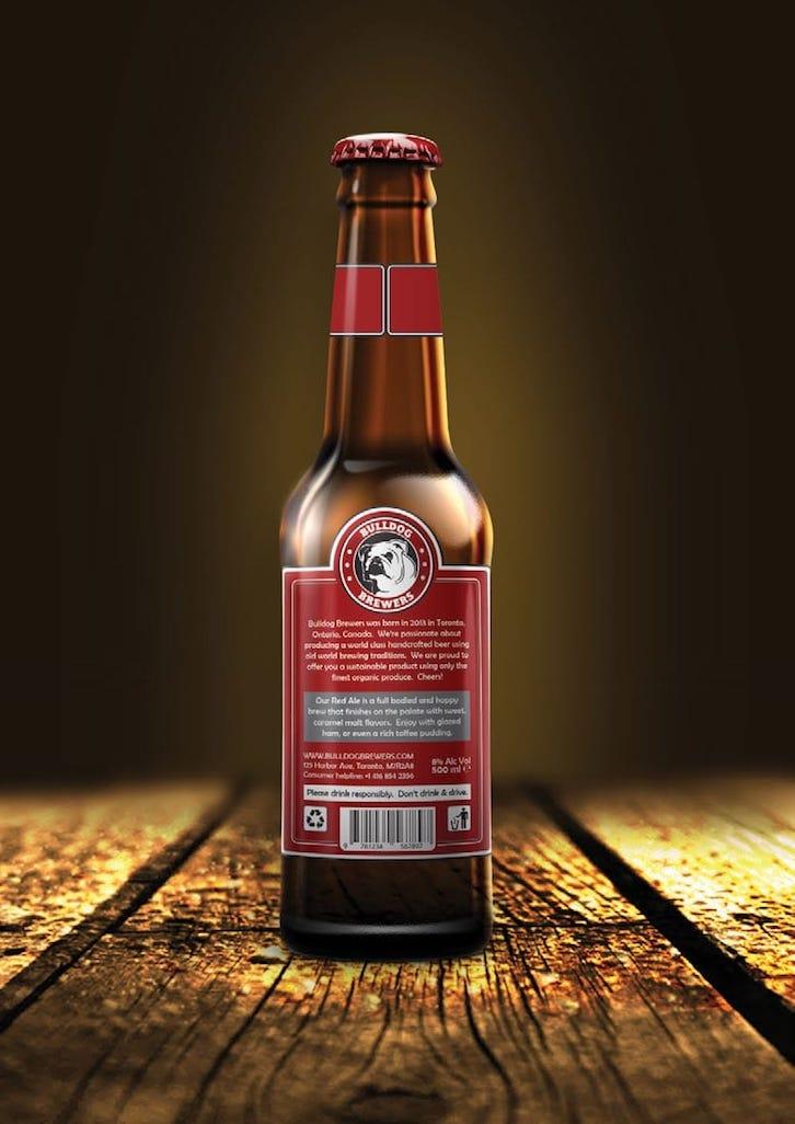
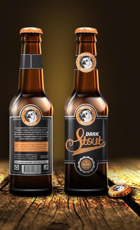
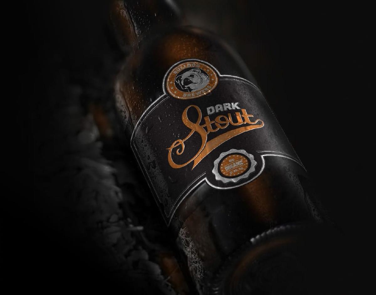
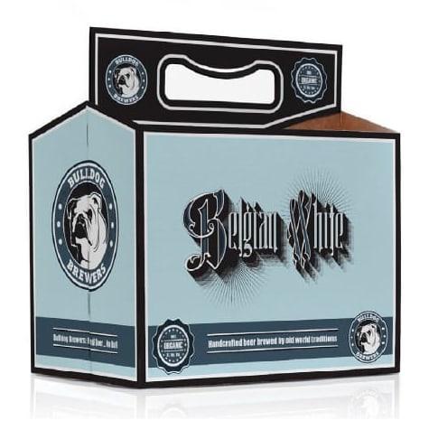
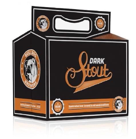
Packaging Design — Bulldog Brewers
“Bulldog Brewers” is a fictitious Canadian micro-brewery. They make a range of three unique organic beers using traditional brewing techniques.
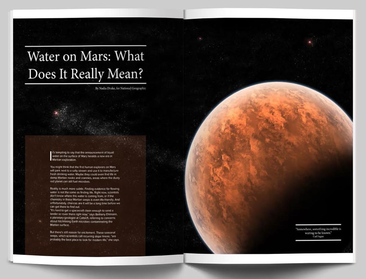
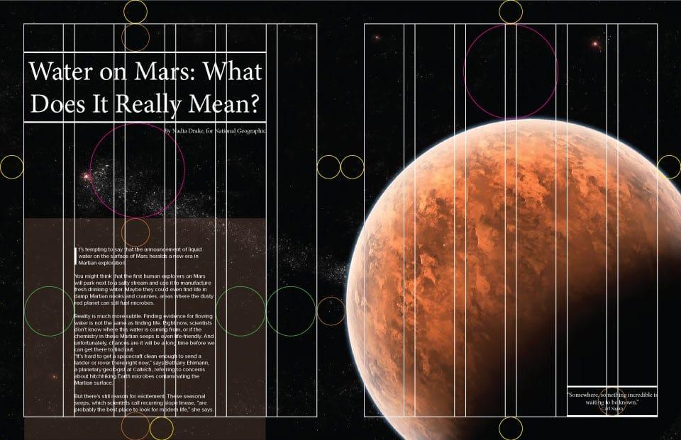
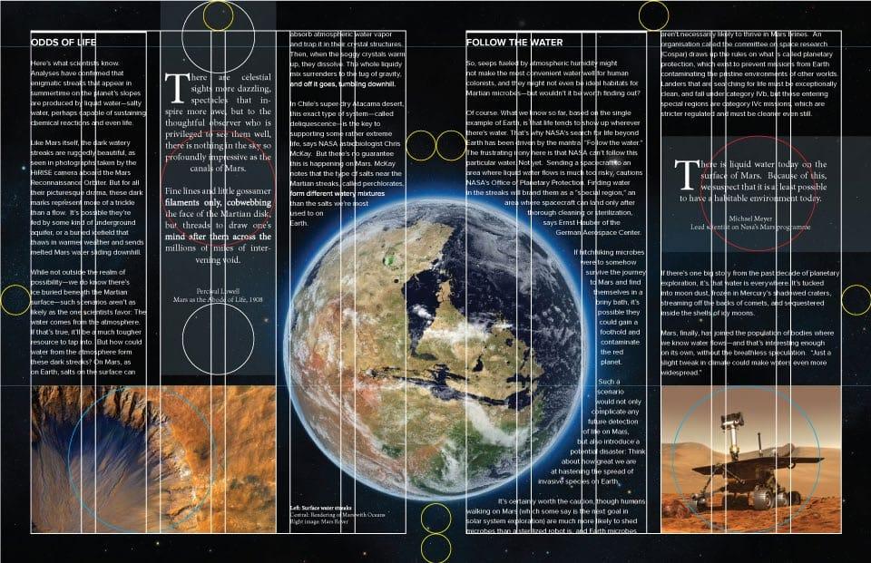
Magazine Design — Water on Mars
The four page spread is based on an article from National Geographic for which a new, more dynamic layout was created.
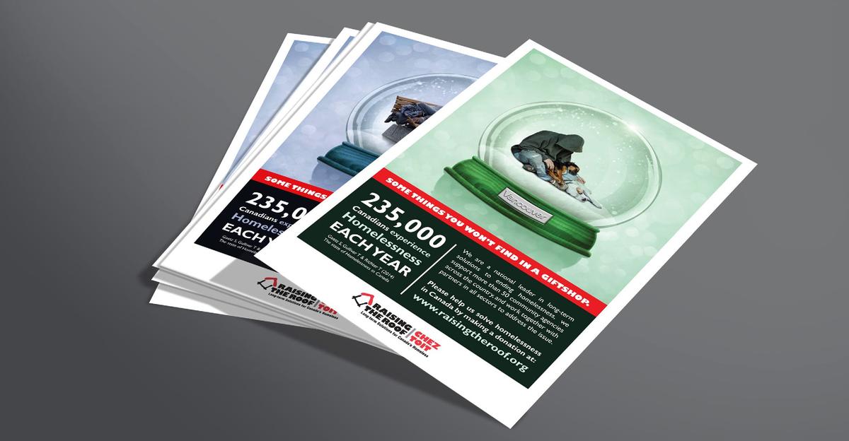
Campaign Design — Raising The Roof
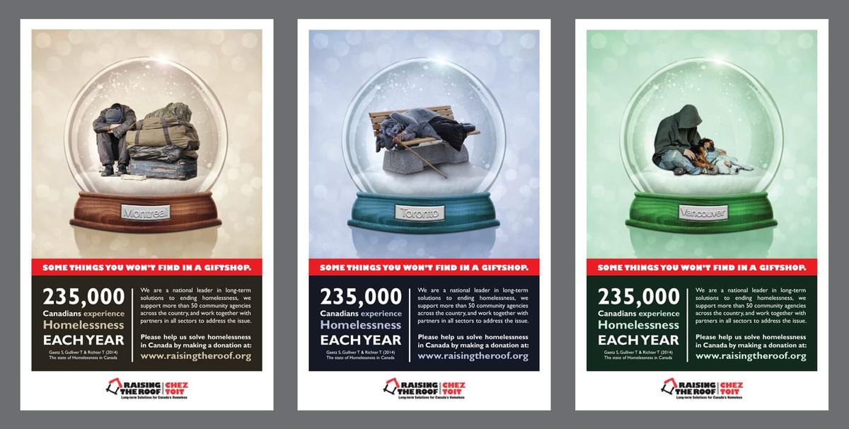
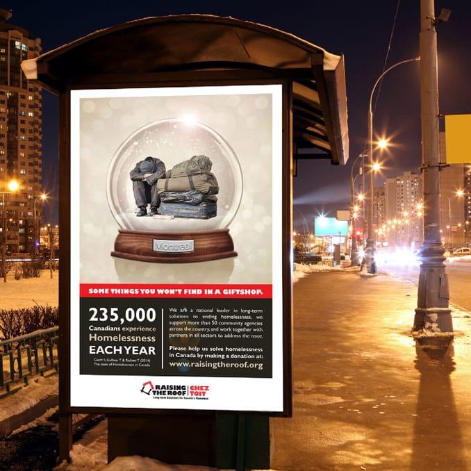
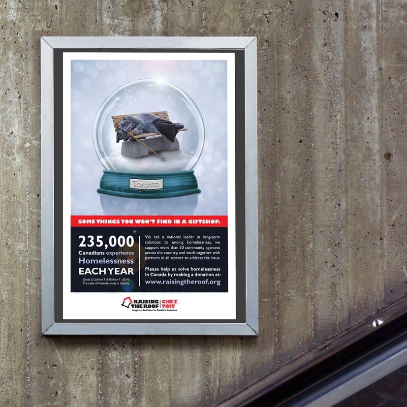
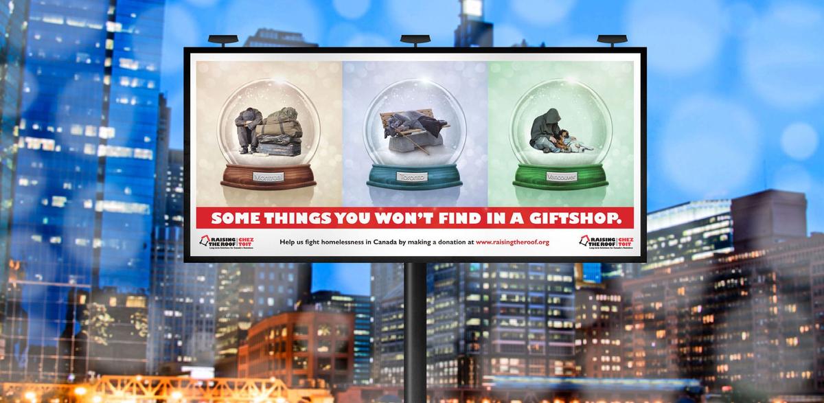
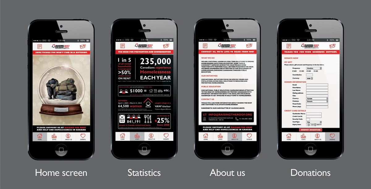
Raising the Roof is a non-profit organization that works with local communities towards finding longterm solutions to homelessness in Canada.
What are you up to in the design world at the moment?
Since I completed my Intensive Foundation Course, I have been freelancing for local ad agencies. This allowed me to connect with creative designers and I have since secured a full time position as an in-house print designer with Xerox Canada. I will be starting in my new role soon!
What is your favourite part of designing?
During the course I really fell in love with the whole design process. From the initial brain storming sessions all the way through to the final refinements, there is something very therapeutic in getting lost in your designs. I see each design not only as a professional learning experience but also an opportunity for personal growth.
Do you feel you have a Niche? If so what would it be?
As a new designer I am trying to learn from all the opportunities that come my way, whether it is print or web, so I haven’t really found my spot yet! During the course however I did love the packaging and campaign assignments. Both required me to think out of the box and pushed me in directions I hadn’t expected.
Tell us anything you would like to about your featured works.
The packaging assignment was a really fun project to do. I loved having to think beyond the format of an A4 sheet and come up with creative solutions.
One of the projects I struggled with most was the animal vector drawing. As someone who was used to drawing in an organic way, it was an interesting process moving towards a more graphic style. As a result I really wanted to use my bulldog illustration in the packaging project. This set the creative process rolling: Bulldogs made me think of an artisan brewery, which in turn made me think of creating something with a vintage feel. This made me want to experiment with hand lettering, and so on. It was a fun process all the way through.
The Raising the Roof campaign was a very personal project. I wanted to highlight the huge problem of homelessness here in Canada. Being relatively new to Toronto I am still saddened daily by the big issue of homelessness here. I wanted to make a design that would touch the viewer and make him/her think. I tried to achieve this by combining imagery that at first seemed disconnected. The snow globe refers to Canada as a tourist destination and also tied in with the Christmas season. The images of the homeless were chosen to be moving while remaining respectful.
The design was united with the Raising the Roof’s identity by matching typography and by using their brand colours as accents within the design.
I found the project very fulfilling on a creative and personal level.
Where to now for you as a designer?
My goal is to keep growing creatively, and learn from my peers and mentors. I am excited to start in my new role and see where the road takes me!
Thanks Sebastian