The Best of European Typography... Ooh la la!
e went to France, Italy and everywhere else that serve great wine and cheese AFTER the dessert, to find the most passionate and sometimes quirky typography designers Europe has to offer. Check out this ‘melange’ with a twist of extraordinary.
The Superscript
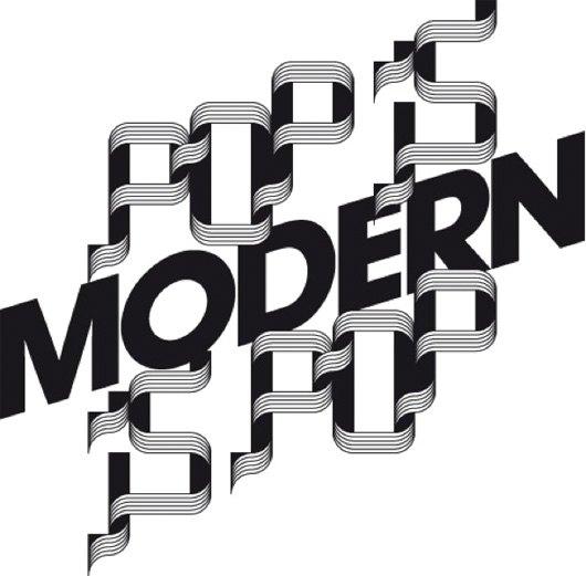
Flag Type a type made using the movement of a flag as inspiration. Boy do we love these Frenchies. Not only do they create awesome original typography, they experiment with elements like sound interactivity, audio sequencing and motion capture to create graphics. Super cool!
Typeradio
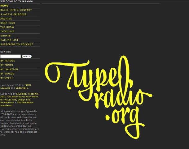
Radio Station for design and type Typeradio is a Micro fm broadcast, a MP3 internet radio stream and a podcast station. Since 2004 Typeradio has been visiting different design events around the world, to meet designers and to talk, some really inspiring podcasts here.
The Superscript (2)
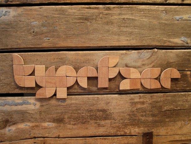
Minimal Bloc we couldn’t resist featuring superscript twice, je t’aime! Minimal Bloc is a type made of two shapes; squares and 1/4 circles. Wonderfully rustic applied here to wood, check out the other applications here.
Robotype
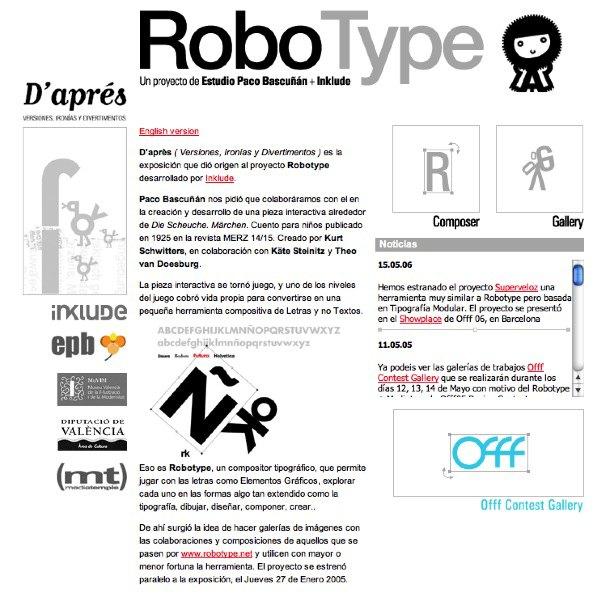
Gallery an off the charts cute site. Use the original interactive gallery to make your own character or scene with fonts: Univers, Bodoni, Futura and Helvetica… those crazy Spaniards… we played for hours!
Ainsifont
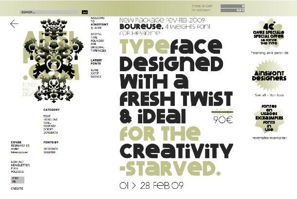
Boureuse a headline font. From the commercial font site Ainsifont. With an extensive and original font library, these guys have plenty to set you back a few euros to give your designs that originality that it may (or may not) need. See the fonts in action in their ‘fonts in use’ page.
Molotro
Minotype a stencil typeface designed by Italian Luciano Perondi. Check out the urban experiments done by Graphic Design students using Minotype.
Barney Carroll
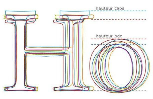
Garamond vs Garamond Don’t panic no-ones calling you a HO! Check out this educational article breaking down the physiology of Francesco Simoncini’s Garamond. Illustrating (very beautifully) the concise differences between the varieties available under the Garamond umbrella. Article originally in French for le Monde, translated into English by Barney Carroll. A must for The Graphic Design School students, re module 4.
Julia Sysmäläinen
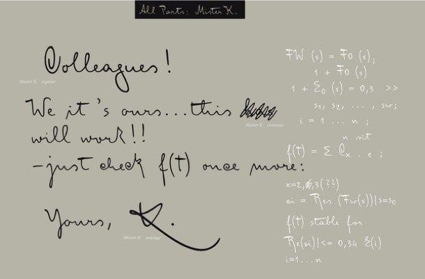
FF MisterK OT The manuscripts of author Franz Kafka had such a profound impact on Finnish graphic designer and type designer Julia Sysmäläinen that she decided to convert his handwriting with its unusually strong calligraphic characteristics into a digital script. You can also purchase this script at fontfont. Our fav type this month at The Graphic Design School. Love your work Julia!
 http://www.behance.net/Gallery/FF-Mister-K
Just van Rossum
FF Dynamoe Min Regular we see them every day, but do we see the letters as typefaces? Dynamoe changes all that. Now you can label your world.. no refills needed! You can purchase this script at fontfont. JVR has a site that sells his latest font designs, its also a visual delight.
What The Font
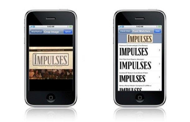
iphone app that has nothing what-so-ever to do with European typography trends, we just couldn’t resist letting you know about our fav new toy. What The Font app let’s you identify a font purely by taking a photo of it. Its the Shazam app of the font world. Like the iphone its the sheer buzz of having everything including the kitchen sink at your fingertips. LOVE IT…and its Free! What the F#*T free? …Yep!
Erik van Blokland
Trixie HD dutch designer Erik takes typewriter realism to another level altogether. A new vectorisation technique was developed to push the level of detail, creating realistic effects in print and on screen. Over 17 million points in the release… but whose counting!
by The School
The Graphic Design School teaches Graphic & Web Design, Online, Anywhere in the World.