Focus :: Contemporary Type Foundries :: Part 1
orking with typefaces is about as basic as it gets for graphic designers. A solid knowledge of type, a keen eye for which fonts are appropriate for each project and an awareness of what’s available to us are rudimentary components of the job. Many fledging creatives use only what they have in their system fonts library and a handful of passable faces saved off a cracked disc of thousands of dubious free fonts. Working this way, a designer can produce perfectly good results (some say this can be achieved through Helvetica alone) but it’s the wise designer who maintains an awareness of modern-day type foundries. Between them, foundries release beautifully crafted, extensive and noteworthy font families year on year. Whilst many cost money (staff at foundries have to earn a living too) some are reasonably priced and others offered for free. And besides the fonts, through their websites type foundries offer all sorts of helpful advice and a glimpse into their fascinating profession, which is what I aim to show here, in the first of two articles on the topic.
In a Nutshell
A type foundry designs and/or distributes typefaces. Originally, type foundries manufactured and sold metal and wood typefaces and matrices for line-casting machines like those made by Linotype and Monotype, and were designed to be printed on letterpress printers. Today’s digital type foundries accumulate and distribute typefaces (typically as digitized fonts) created by type designers. Some type foundries also provide custom type design services.
The Foundries
CastleType

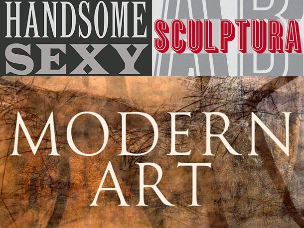 The CastleType homepage (top) and samples above from (clockwise) Latin Ct, Sculptura and Goudy Trajan. Imagery used with kind permission of © CastleType.
San Fransisco-based independent type foundry CastleType was established in 1990 by Jason Castle, and specialises in revivals, classic styles, decorative fonts and custom font design. Custom services offered are extensive, taking in logo digitization (whereby customers supply their logo and a digital version is added to a favourite font) and the digital rendering of existing typefaces.
The revival and classic styles are remarkable for their elegance and the display faces are bold and confident. Jason is currently busy expanding his Goudy Trajan family with Cyrillic and Greek characters and the release of Sonrisa —a precise and friendly looking sans serif— is iminent.
Dalton Maag
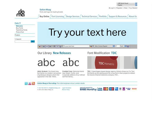
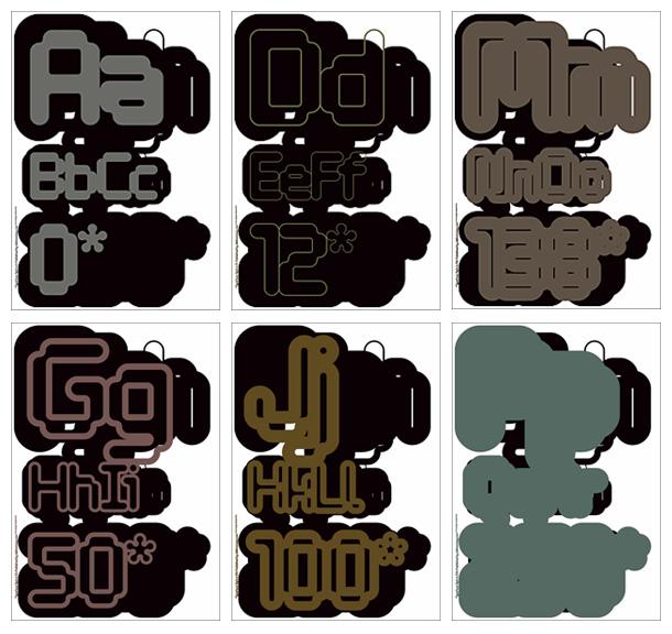
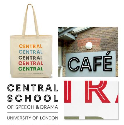 A shot from Dalton Maag’s website, the limited edition Tephra prints and pictures of a custom font designed for the University of London’s Central School of Speechf & Drama in use. Imagery used with kind permission of © Dalton Maag.
London-based Dalton Maag has been designing fonts and logos and “supporting and assisting people in deepening their typographic skills” since 1991. In that near-two decade period they have seen exciting growth but what makes them remarkable is their branching out into both Cairo and Brazil—endeavours to contribute to emerging visual and typographic cultures in each country’s continent. Through doing so, Dalton Maag’s resumé has expanded to take in the vast typographic expanses of both the Arabic alphabet and South American languages.
Emigré
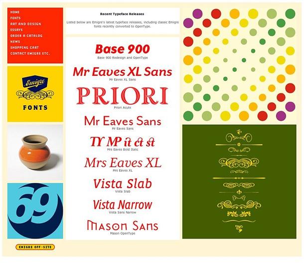
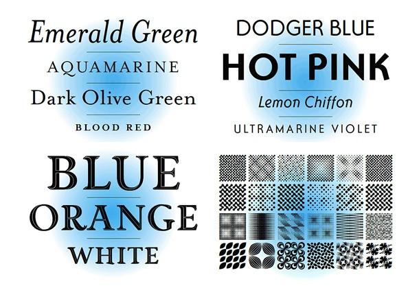 A page from Emigré’s exuberant looking website and samples of their fonts. Clockwise from upper left: Mrs. Eaves, Ottomat, Puzzler and Priori Acute. Imagery used with kind permission of © Emigré.
Yes, that Emigré, the iconic, much-mourned design journal Emigré. Some colleges and universities become so preoccupied with teaching their students of the cultural significance of the journal that they neglect to mention that the entity lives on in online form, with an archive of articles from the journal, an excellent shop and large collection of surprising and esoteric fonts available for download. These are of a diverse nature, though one thing that seems to permeate much of the collection is the jaunty angles which adorn the fonts’ serifs.
Tiro Typeworks

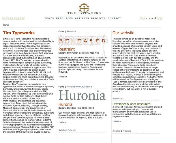
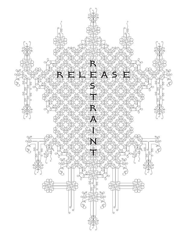
Tiro Typeworks’s graceful and formal homepage and a glimpse of their acclaimed ornamental typeface Restraint. Imagery used with kind permission of © Tiro Typeworks.
Tiro Typeworks was established in 1994 by John Hudson and Ross Mills and has evolved into a highly regarded foundry with a reputation for custom typefaces and font solutions. What makes them stand out from other comparable foundries is their expertise in multilingual computing and publishing, which they have specialised in since 1997. Their work in this area includes extensions to existing Latin typefaces and new typefaces for Arabic, Canadian Aboriginal Syllabics, Burmese, Cherokee, Cyrillic, Ethiopic, Greek, Hebrew, Latin, Ogham and Tahi scripts. Impressive stuff. An ornamental typeface of theirs that really stands out is Restraint, described as “an ornamental font which happens to contain letterforms. It is 100% fanciful all the time and not for the timid of heart.” A tour around Restraint, as well as the wider work Tiro are involved in, is highly recommended.
Fontsmith

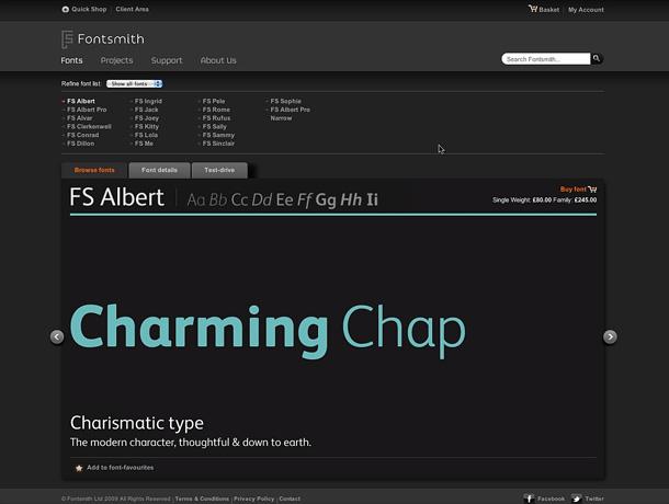
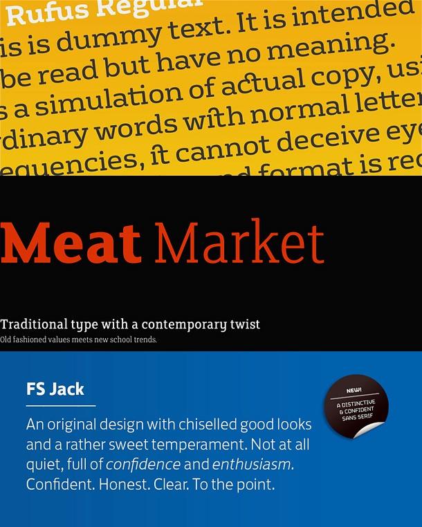
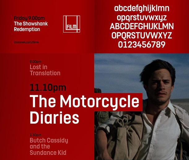 Fontsmith’s homepage, a medley of typeface samples from the foundry (Rufus, Clerkenwell and Jack) and examples of the custom typeface designed for Film4 in action! Imagery used with kind permission of © Fontsmith.
Fontsmith is a leading London-based type design studio founded in 1999 by Jason Smith. The studio consists of a team dedicated to designing and developing high quality typefaces for both independent release as well as bespoke fonts for international clients. In addition to their wide range of exceptional typefaces available through their website, Fontsmith are also noteworthy for having custom designed typefaces as part of rebranding projects for such celebrated clients as Channel 4, Mencap and BBC 1. Your writer uses a Fontsmith typeface —Clerkenwell— as part of his identity.
OurType
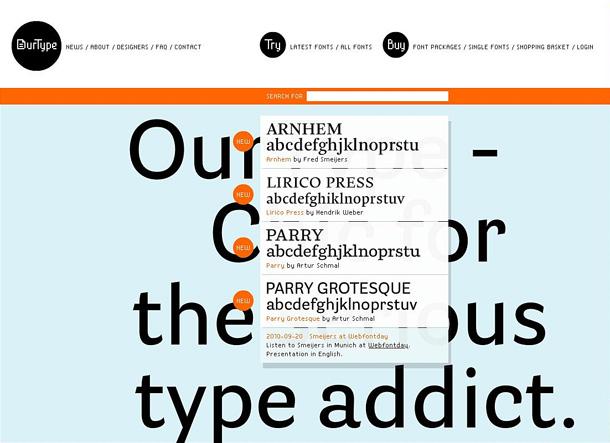
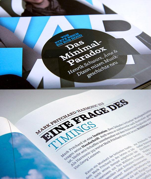
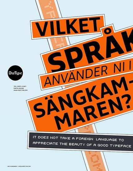 The formal though playful homepage of OurType (the black ‘try’ and ‘buy’ circles at the top bounce around with the movement of the cursor), OurType’s Parry font as seen in De Bug magazine and a self-promotional poster from the Foundry. Imagery used with kind permission of © OurType.
Founded in 2002, OurType states it “has a vision that is different from most other font companies. It publishes newly designed fonts that are tailored to contemporary needs. Yet it respects traditional values, and strives for the highest quality of product. So it stands equally apart from those who are enslaved to the new and those who merely try to recreate the past. OurType fonts are useful, durable and attractive tools for anyone using type now.” The website contains lots of playful movement and the fonts offered are indeed contemporary yet formal.
To be continued…
A further six type foundries will be previewed in the second article in the series. Watch this space!
by