6 Things To Keep In Mind When Designing A Logo
aulywood for istockphoto has released an article on logo creation. A great article for those graduates or students wanting to get into creating logos for istock. Below are our fav excerpts, check out the whole article, its well worth the read.
6 Things To Keep In Mind When Designing A Logo
It All Starts With a Great Idea
By clearly visualizing who your client is and with some forethought, research and planning, the end result should be an appropriate symbol that immediately identifies the company, and clearly communicates the product or service. This is absolutely key to a successful logo design and should always be foremost in your mind while conceptualizing your design.
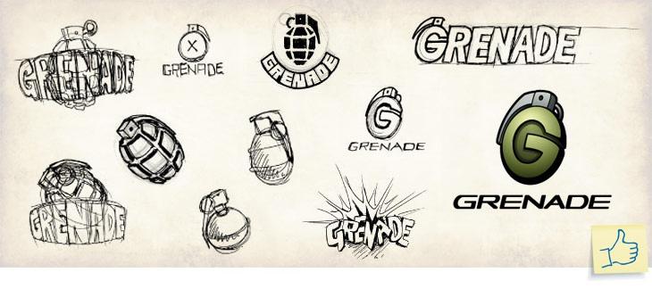
When you have your concept, start sketching it out to quickly come up with ways you can execute the idea. Starting in black and white can help ensure that your design is clear, legible and reproducible without any distracting features. Adding great color, style characteristics, or subtle effects will help make your design unique to stand out amongst the competition. Add some type to bring some context to your design and choose a font that compliments the symbol and communicates clearly. To ensure a successful logo remember to keep your design, Simple, Memorable, Timeless, Versatile, and Appropriate.
Reproducibility
The excessive use of detail in this logo will seriously compromise its ability to be reproduced. Fine details like the sharp pointed tail and thin lines will disappear when printed at smaller sizes and the small white shapes will fill in losing their definition. Outlined type with extreme gradients will print poorly as well, making the type hard to read at any size. On the right, the elephant is drawn with bold shapes, leaving ample white space in between for definition. Just the right amount of detail is used to help convey the idea and the solid flat colors used will ensure that this design will reproduce great with pretty well any process. I wouldn’t recommend using multiple colors like this in the type all the time but in this case it works to make it fun and exciting.

Color Palette
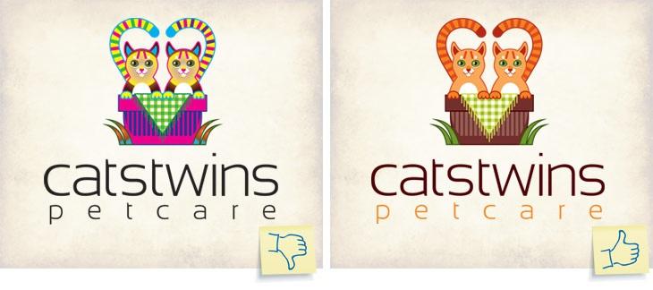
The sample on the left is using far too many colors than is necessary, making it very busy and more difficult to define the individual objects. The use of fluorescent and uncomplimentary colors makes the overall composition unappealing and less attractive. Using default colors straight from the swatch palette and plain black for the type make the design much less sophisticated than it could be. The sample on the right utilizes a beautiful main palette of custom mixed complimentary colors of orange, green and brown. They all work together in harmony to bring the cute kitties to life while adding a warm and cozy feeling. The use of dark brown for the type keeps it complimentary to the graphic and maintains a good contrast necessary for legibility. Using the same orange that’s in the kitties for the “petcare” type offers additional visual interest and helps separate it from the main type. This helps give the eye a break and enhances legibility as well.
Simple is good right?
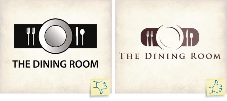
The left example is very simple in its execution, using only basic square and circle shapes. The placement of all of the objects has left the overall composition looking static and boring while the plain black type is under considered, effectively ensuring that this logo generates about as much excitement as flossing your teeth. The example on the right however, has cleverly used positive and negative space to create the plate. The entire logo is comprised of only four shapes by creating two simple arcs to help define the plate and by letting the cutlery bleed off the bottom edge. The combination of these design choices and using Tragan for the font, give it a simple, classic, stylish feel appropriate for this audience.
Choosing a Typeface
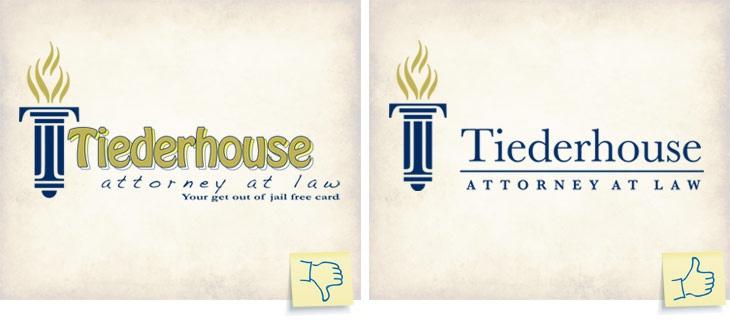
Hard to read? It sure is! Skinny outlines, drop shadows and other effects used on type all work against keeping it clear and legible. The “Tiederhouse” text is too tightly kerned while the “Attorney ay law” type has far too much letter spacing. The type is placed too close to the graphic without enough breathing room and the tagline is much too small in proportion. The “Tiederhouse” text uses the font “Hobo” which is a 70’s style font not at all appropriate for a professional law office. The sample on the right uses a much more professional and appropriate looking serif font with spacing and shapes that seem to mimic the construction of the symbol. It’s clear, easy to read and is just the right amount of distance from the torch device. Making the line between the text gold colored would have been a nice touch.
To read the whole article and image credits please see istock
To feast your eyes on a collection of logo designs and galleries see HERE
by